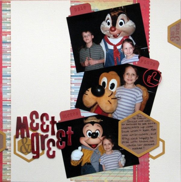
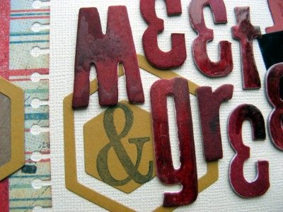
My photos were larger than the sketch required so they needed overlapping and some jaunty angles to fit. The title alphas are a mishmash of different chipboard sets adapted for my page: the M is a W, the Es are &s and those Ts started life as 4s! Lots of inking was required to get them to be similar colours - it wasn't evenly done as some were bare chipboard and others had a white base layer. I
P.S. There's still time to sign up for the Counterfeit Kit Challenge Blog Members Blog Hop - check out the challenge here. { I'm planning another go with this - I reckon Hubby might appreciate a Valentine's card with a list of why I ♥ him ... no photo, just a list ... I'm sure that will count for the challenge :o) }


18 comments:
Looks gteat. well done for making good use of leftover letters
Aw Pluto - my favourite Disney character. Nice to see more die cutting. Great page :)
Great page, Jemma :) I love adapting odd letters and numbers to make titles work - and I quite thought the uneven colouring was a deliberate effect!
I like the overlapping and really like how you colored the letters.
Rinda
I love what you did with the alphas, Jemma!
Alison xx
This looks great - I like the hexagons & you did a fantastic job making the letters you had work for you.
a great page...the hexagons look good.
Great page. I will have to remember that tip for my alphas.
what cute photos to scrap and capture the memory! Love the colours and great idea on the letters!!
Hexagons are great fun!!
Love the letters and the notebook punch on the side! Great job!!!
I like how you used the hexagons.
That's a great way to use up alphas - they do the job well!
love that title, and the use of vertical lines is great
Great page - love what you did with the letters. I like the multi-tone and shine of them :).
Awesome grungy letters! I'm always 'adapting' alphas too, it's a great way to use them up! x
Adapting alphas is one of my favourite things when it gets towards the end of the pack. Isn't it fun when you find a good embellishment - that thumbs up clip is just right.
Clever title work, and I love how a couple of simple hexagons make such a difference to your page!
I really love how you addapted the letters. We all have the same problem with the missing letters :).
I also love the grungy look.
Post a Comment